 For some, the allure is elicited by the names that glow in the darkness as if drawn with a magical luminous pen: Vista del Sol, Desert Moon, Blue Angel, Lucky Cuss, Kiva, Sky Ranch - all monikers designed to stir the imagination. Others attract by employing larger-than-life, iridescent figures that slowly flicker in the twilight, then spring forth with life. Galloping horses pull the careening Butterfield Stage along the wagon road, its wheels spinning wildly in the night. Voluptuous blonde damsels swan dive fearlessly into swimming pools from death-defying heights. With golden kinetic lassos, wranglers impress greenhorns with clever rope tricks. Mounted Indian warriors relentlessly rain crimson arrows on a lone Pony Express rider. Burros, with flicking ears and swishing tails, clamor for attention, while motionless owls thoughtfully study their surroundings through pince-nez. Burning brightly in the night, these names and figures serve as neon signs advertising motels along Route 66 and other highways of the pre-interstate era which traverse the arid landscape of the American Southwest.
Advertising what are commonly termed "Mom and Pop" motels, these neon signs are among the most spectacular commercial advertisements ever constructed. They could be considered commercial folk art that, whether measured in terms of numbers or flamboyance, reached its zenith in the Southwest. This was due to the year round tourist season and the use of imagery stemming from the regions scenic landscapes, exotic cultures, and colorful history idealized as representing the American Dream. Despite their often gargantuan size, these signs exude a homespun appeal that captures the promise and excitement of the post-World War II age of auto travel in which many of them were created. As the signs were designed to be synonymous with vacations and emit an aura of excitement, they yield a treasure trove of images ranging from generic to unforgettable that the world recognizes as distinctly American in origin. Motels and their signs could be thought of as not only satisfying motorists' lodging needs, but also their requirement for adventure.
 After a period of being considered tasteless and gaudy intrusions on the roadside, these neon displays are enjoying a renaissance. Travelers influenced by nostalgia - or simply looking for something different - are drawn to these motel signs and can frequently be found bathed in the glow of their neon splendor, mesmerized by these colorful advertising edifices and the hypnotic buzzing of their glass tubing. The New Wave of film producers and photographers also use them as visually appealing backdrops for a slice of pure Americana. With their anachronistic charm, these neon signs continue to attract and enchant those who come upon them. For many foreigners vacationing in America, a trip down Route 66 to catch a glimpse of these roadside beacons is the highlight of their overseas trip. As Valdimer Nabokov wrote in Lolita, "Nothing is more exhilarating than philistine vulgarity."
Motel signs tend to stand out in the "theatre of the roadside," since they are typically larger and showier than advertisements of other highway enterprises. Their dependence on the tourist trade necessitated the construction of extravagant signage, as opposed to cafes and gas stations that could depend partially on local traffic to sustain business. The most eye-catching motel signs tended to be located where the competition for overnight lodgers was keen and few zoning ordinances restricted their size and form. During their halcyon period, highway strips along well-traveled roads such as Route 66 or in major tourist destinations such as Albuquerque or Phoenix were filled with lush, multicolored glowing pictures. The latter city even had the nickname, "the motel capital of the world."
 Mom and Pop motels ruled the roadside along highways such as Route 66 that, from the 1930s - 1970s, were the main thoroughfares bringing legions of travelers to the Southwest. This cottage hospitality industry evolved from the desire of motoring travelers for better overnight accommodations. The first intrepid auto travelers to the Southwest in the 1910s were limited in lodging options to camping or the occasional railroad hotel. With increasing numbers of motorists heading to the region by the 1920s, entrepreneurs began constructing auto or tourist camps. These facilities were composed of tents or shacks that were positioned around a common bathroom area. With better roads and the proliferation of the auto bringing even greater traffic in the 1930s, roadside lodging evolved into what were originally motor or tourist courts and typically later renamed "motels". The difference between a court and a motel was mainly semantics, though courts tended to have cottages separated by landscaping or garages while motels typically had units adjoining one another. Thus, overnight accommodations for motorists evolved incrementally, though rapidly, until by the 1940s the motel was the undisputed lodging king of the two-lane highways.
Auto or tourist camps met their roadside advertising needs with ordinary signs; however, competition for the overnight traveler greatly increased with the advent of the motor court and motel. Although some early courts advertised their presence by having buildings imitating historical residences, such as wigwams, log cabins, and forts, for the most part the architecture and rooms of motels were already standardized. This made the motel's roadside sign an all-important facet in attracting business. Similar in function to another regional structure, the false-front building, motel signs were designed to make their enterprises seem larger and more glamorous with a minimum of added cost. Often these signs dominated the landscape, with their non-assertive motel buildings snuggled below or behind them, a precursor to later sign development in areas such as the Las Vegas strip.
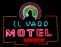
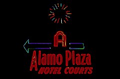
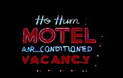
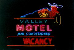
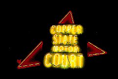 Signs advertising Mom and Pop motels are products of individual taste and effort. Consisting of heavy steel boxes laden with transformers, they range from vertical signs reaching towards the sky, fascia signs stretching horizontally along the motel office, to kidney, cactus, or otherwise uniquely shaped. Decorations include hand-painted, one-of-a-kind scenes and lettering. In daylight, these monolithic signs serve as a black silhouette against the sky as well as a multicolored structure in the sun. With their vespertine nature, during the day the signs create only a distant echo of the excitement generated in the evening. Once illuminated with reams of glass tubing, their crackling, multicolored, neon lighting creates a mystical roadside spectacle. With the aid of timers, some signs became animated, literally coming to life with movement.
The motel sign's main function was to brazenly grab the attention of speeding motorists and coax them off the road. The sign's message and imagery had to be simple so travelers could read it quickly and understand what it meant. Yet in order to stand out among the cacophony of roadside images, a hint of the spectacular was necessary. A tightrope was often walked by designers who attempted to have signs look exotic enough to attract travelers, but yet not scare them away by appearing too foreign. Neon was the favored form of lighting, typically illuminating the establishment's name as well as being crafted into arrows, objects, and figures to provide additional attraction. Through these names, images, and neon colors, each motel sign strives for uniqueness, yet the neon element unites them into a genre.
 For motels in general, items such as the name and associated imagery became important considerations when constructing a sign. While hotels of the era frequently had monikers with business (Commercial) or patriotic themes (Congress) designed to attract the traveling salesman and match the stiff formality of their accommodations, motels had no historical precedent and were free to be creative. Strong symbolism and eye-catching themes provided the most common hook for the motorist. Successful motel advertising was often comprised of simile and metaphor as well as being cloaked in cultural and historical themes to suggest an escape from mundane routines. Typically, themes begun on signs were continued in buildings, landscaping, and rooms so that some motels approached a theme park status and served as precursors to the recreated "Disney-esque" environments so pervasive today.
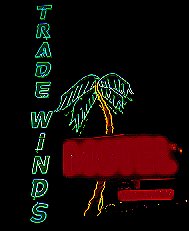
Southwestern motels were built largely to accommodate visitors who wanted to experience the vanishing frontier, yet didnt want the reality of spending the night in a ranch bunkhouse or Indian hogan. To capitalize on this craze for the region that permeated American popular culture, many motels adopted regional themes familiar to customers that would satiate their vicarious frontier yearnings. Often the chosen names and symbols weren&t necessarily indigenous to the specific area, but were easily recognized by the public due to paintings, dime novels, movies, and television. The likeness to the Southwest portrayed by these mediums was often tenuous. Many themes can be considered a hybrid of tourist expectations from the entertainment industry as well as motel owners seeking nationally, as well as regionally, recognized imagery. This explains the weak symbolic relationship motel names and images sometimes have to their area, a classic example of which is the saguaro cactus. Although this plant's botanical range is limited to portions of Arizona, due to its popularization by Hollywood, the saguaro cactus has "wandered" outside its given terra and currently grows on motel signs across the entire American West. It seems this cacti's presence accentuates the "Southwest feel" of any given sign.
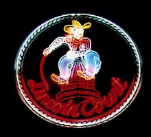
 Although motels in general have attractive, catchy themes, Southwestern motels tended toward more exotic culturally flavored ones. Often, a motel sign would not consist of a single theme but have bits of others for more widespread appeal. In trying to nostalgically recreate a frontier world that was passing away, the cowboy became the dominant motel image of the region, symbolizing individual freedom, pioneer spirit, and moral fortitude. The wrangler's mythological chief antagonist, the Indian, was also a featured player in the pageant of the frontier that defined the pop culture Southwest. The complexities of the Native American culture were largely ignored with tribes and customs interwoven and misplaced. Hispanic culture was also a common sight, with its quaint and charming aspects emphasized. Many other indigenous Southwestern motel themes exist: natural (flora, fauna, sun, oasis), historical (explorers and trails), economic (mining and ranch). Nationwide motel themes were also used: geographical (Hilltop Motel or Copper State Motor Court), highway/travel (the Curve In Motel, Highway Host), traditional (Holiday Motel), word play (the Dun Rovin Motel), illicit (the No Tel Motel), owner's name (Betty's Motel), and exotic (gambling, Polynesian, and others).
Despite their scale and beauty, survival has been difficult for these individualistic motel signs built from the 1930s - 1960s. Many motels were victims of location (bypassed highways and deteriorating neighborhoods), changing tastes, and a far more competitive business environment dominated by major corporations. Some motels have survived but their large neon signs have been replaced by nondescript plastic back lit signs because of the expense and difficulty of working with large old signs as well as perceived aesthetics. Meanwhile, motels and their signs built since the 1960s have become more standardized with chains and franchises dominating new construction. The rich diversity of signs has vanished as the lodging industry has moved toward the least common denominator, mostly submerging any regional distinctiveness. The narrowing of the hospitality industry to fewer and fewer choices has only made these creations from the neon era stand out all the more.
 The remaining pre-interstate motel signs are inanimate barkers pleasing to the eye and endeared by the masses. They are windows to a past when chatting with gas station attendants was a facet of cross-country travel. Their names and imagery are often eccentric and, upon reflection, quintessentially American and speak of a country of unbounded humor, optimism, and faith. Motel themes sometimes had little to do with their locale and were hardly the real McCoy, yet they captured the fun of being on the road. These motels became the perfect place for those with a restricted budget and a little imagination to drift away to exotic places - one didn't even have to worry about obtaining passport photos or booster shots before checking in!
Some particularly noteworthy signs have even become landmarks in certain areas - local symbols that reflect and enhance sense of place. Their timelessness is a tribute to the creativity and skill of largely anonymous people who designed and constructed them. Perhaps most importantly, these signs continue to bring in business. They also remain more successful than their modern day counterparts in attempting to provide a unique atmosphere - if contrived and hokey as fostered in advertising - that brings a bit of adventure and stimulation that travelers leave home in search of in the first place.
So think twice next time you pass by a glowing rider atop a rearing quarter horse who, with a sweep of his ten-gallon hat, offers a Southwestern welcome as big as the region's vistas. Besides the free light show, legend has it that an evening spent slumbering by one of these resplendent signs elicits particularly vivid dreams by stimulating brain neurons. . . .